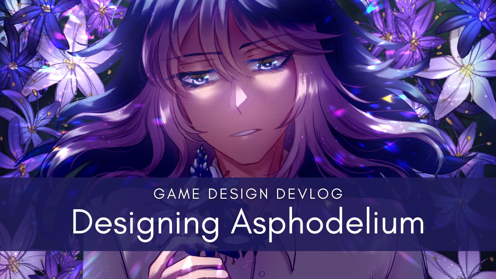
“Asphodelium” is a combination of “asphodel” and “lilium”. Both of these are flowers related to death, grief, and regrets.
Asphodelium is a melancholic slice-of-life visual novel about literally living with your past regrets, your grief manifested into your new roommate that you have to help. Because of this, I wanted the visual novel to have more narration than I usually write so as to set the mood of the story more effectively.
Most visual novels nowadays are displayed in ADV mode, which is short for adventure mode. It’s where the textbox is at the bottom of the screen and is what most people think of when they say “visual novel”.

However, I’ve always been a fan of NVL mode and felt it was more effective for delivering long narration segments. NVL mode, which is short for novel mode, is where the textbox covers most or the entire screen. That’s the format I knew I wanted for Asphodelium.

I designed the GUI for Asphodelium, using free to use assets from Clip Studio. I combined and edited them into what you see here. It’s very simple but evocative of what I wanted.
Asphodelium is lite horror (a doppelganger of the ex-cult leader you killed finds you) but it’s also partially fantasy, with magic being a part of the world but kind of a back seat in this story itself. Still, I wanted the user experience to invoke a bit of that fantasy feeling.
For the GUI & logo, I had a few key elements:
- flowers (namely an asphodel)
- ornate (but not overly detailed)
- fantasy & ethereal
- lots of periwinkle
The asphodel being the main element of the game is important since, well, it’s the title of the game and represents regrets and remembering someone after death. The story is set in a turn of the century-esque world, not quite Victorian but not quite modern, as magic has improved people’s living standards but the electric age isn’t in full swing just yet.
I also love the color purple and making my games very blue & purple and with Aster’s hair being periwinkle & blue it fits the game well. It’s also a great way to set the mood, as the blues & purples are more somber.
You can see this best in the logo, designed by Baguetti.

She provided several different concepts for how the logo could look based on the above criteria. My favorites were A, H, and I!
We ended up proceeding further with A, as it had such a striking fantasy vibe. I really liked the silhouette dissolving into the flower petals as they fly off.

The next part was determining how to display the font! Baguetti again provided a lot of choices for how to style the title as well as flower choices for behind the silhouette.
We ended up going with something in between 2 and 3 and making the silhouette look closer to Aster. The final result was…

With the artwork, it keeps the very melancholic fantasy vibes I was looking for.
If you haven’t played Asphodelium yet, check it out! It’s free and around 4 hours long. I haven’t spoiled anything here that’s not already on the itchio page.
— Arimia


